Getting started
An overview of Bootstrap, how to download and use, basic templates and examples, and more.
An overview of Bootstrap, how to download and use, basic templates and examples, and more.
The fastest way to get started with EchoX Bootstrap is to reference the compiled and minified CSS and JavaScript from the CDN.
These are the CDN URLs you will need to include in your HTML:
/dist/css/echox-bootstrap.min.css /dist/css/echox-bootstrap-theme.min.css /dist/js/echox-bootstrap.min.js <!-- Latest compiled and minified CSS -->
<link rel="stylesheet" href="/dist/css/echox-bootstrap.min.css">
<!-- Optional theme -->
<link rel="stylesheet" href="/dist/css/echox-bootstrap-theme.min.css">
<!-- Latest compiled and minified JavaScript -->
<script src="/dist/js/echox-bootstrap.min.js"></script>
Within the CDN you'll find the following urls, logically grouping common assets and providing both compiled and minified variations.
http://[host]/[version]/dist/
├── css/
│   ├── echox-bootstrap.css
│   ├── echox-bootstrap.min.css
│   ├── echox-bootstrap-theme.css
│   ├── echox-bootstrap-theme.min.css
├── js/
│   ├── echox-bootstrap.js
│   ├── echox-bootstrap.min.js
└── fonts/
    ├── glyphicons-halflings-regular.eot
    ├── glyphicons-halflings-regular.svg
    ├── glyphicons-halflings-regular.ttf
    └── glyphicons-halflings-regular.woff
This is the most basic form of Bootstrap: compiled files for quick drop-in usage in nearly any web project. We provide compiled CSS and JS (echox-bootstrap.*), as well as compiled and minified CSS and JS (echox-bootstrap.min.*). Fonts from Glyphicons are included, as is the optional Bootstrap theme.
Please note that all JavaScript plugins require jQuery to be included, as shown in the starter template.
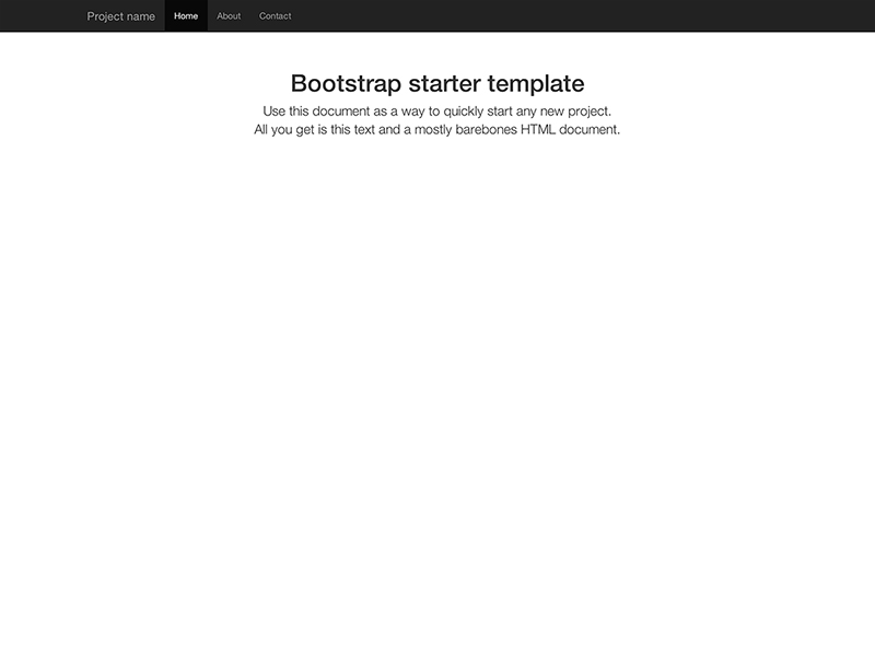
Make use of a super basic HTML template, or dive into a few examples we've started for you. We encourage folks to iterate on these examples and not simply use them as an end result.
Copy and paste the HTML from below to get started with a bare bones Bootstrap document.
<!DOCTYPE html>
<html>
  <head>
    <title>Bootstrap 101 Template</title>
    <meta name="viewport" content="width=device-width, initial-scale=1.0">
    <!-- Bootstrap -->
    <link href="css/echox-bootstrap.min.css" rel="stylesheet" media="screen">

    <!-- HTML5 shim and Respond.js IE8 support of HTML5 elements and media queries -->
    <!--[if lt IE 9]>
      <script src="../../assets/js/html5shiv.js"></script>
      <script src="../../assets/js/respond.min.js"></script>
    <![endif]-->
  </head>
  <body>
    <h1>Hello, world!</h1>

    <!-- jQuery (necessary for Bootstrap's JavaScript plugins) -->
    <script src="//code.jquery.com/jquery.js"></script>
    <!-- Include all compiled plugins (below), or include individual files as needed -->
    <script src="js/echox-bootstrap.min.js"></script>
  </body>
</html>
Build on the basic template above with Bootstrap's many components. Check out some of the more advanced tips for how to customize and build on top of them.
Nothing but the basics: compiled CSS and JavaScript along with a container.
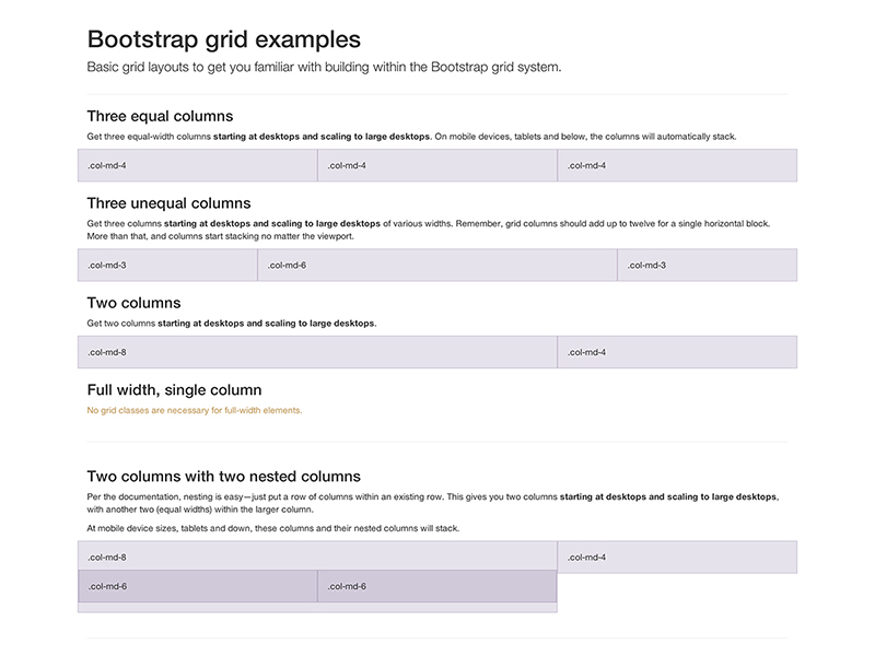
Multiple examples of grid layouts with all four tiers, nesting, and more.
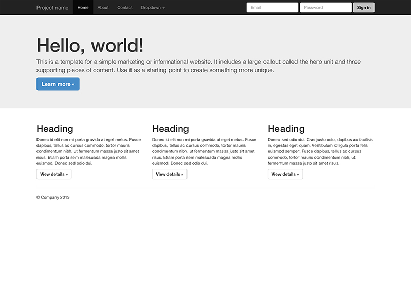
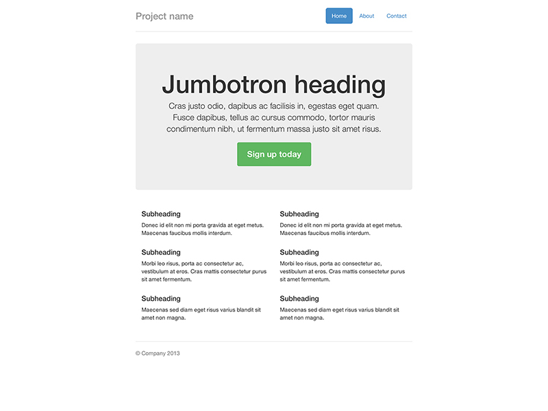
Build around the jumbotron with a navbar and some basic grid columns.
Build a more custom page by narrowing the default container and jumbotron.
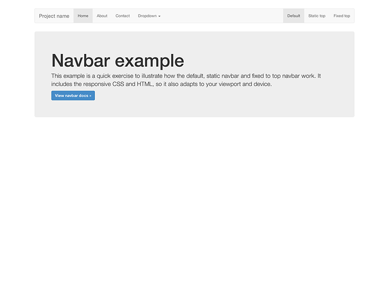
Super basic template that includes the navbar along with some additional content.
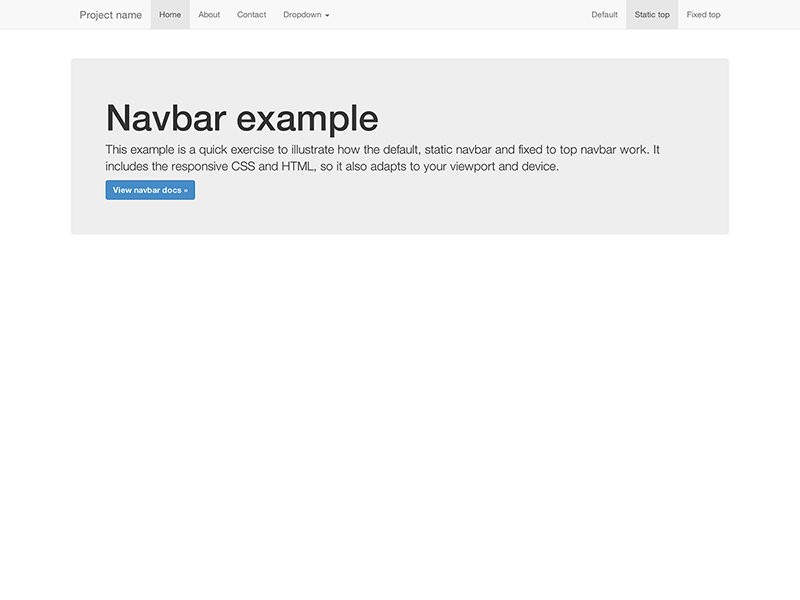
Super basic template with a static top navbar along with some additional content.
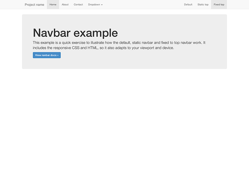
Super basic template with a fixed top navbar along with some additional content.
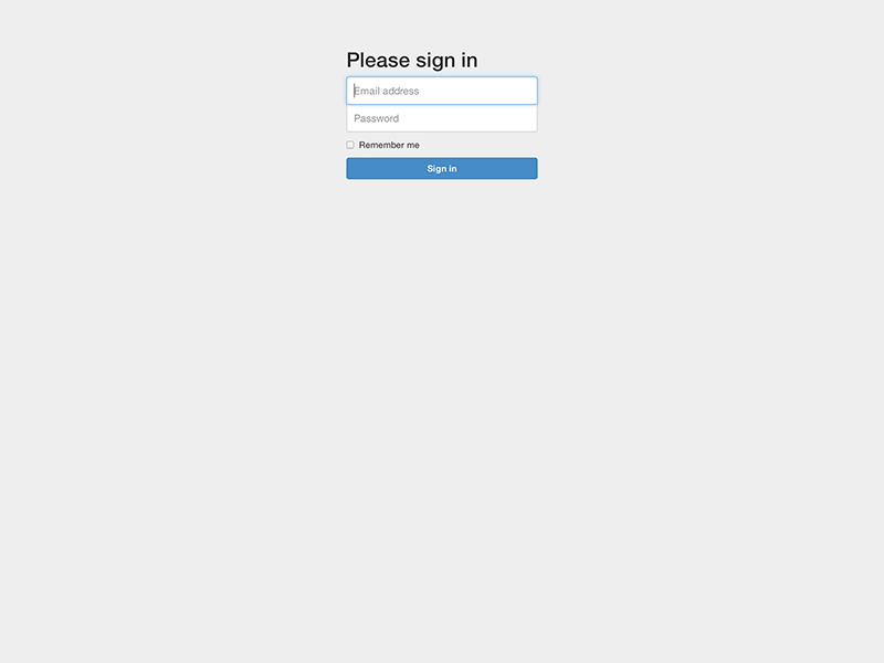
Custom form layout and design for a simple sign in form.
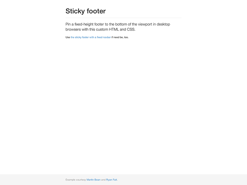
Attach a footer to the bottom of the viewport when the content is shorter than it.
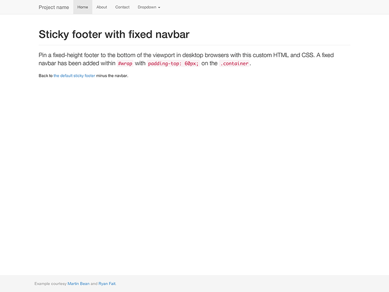
Attach a footer to the bottom of the viewport with a fixed navbar at the top.
Expand on the default navbar and more to create justified navigation links.
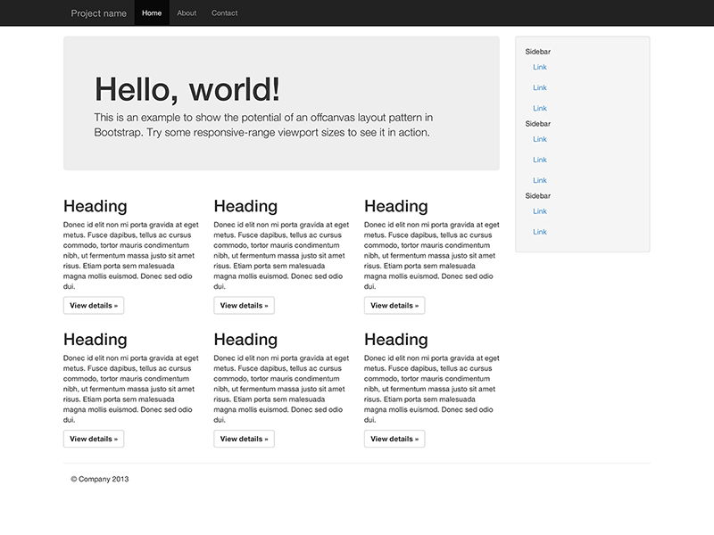
Build a toggleable off-canvas navigation menu for use with Bootstrap.
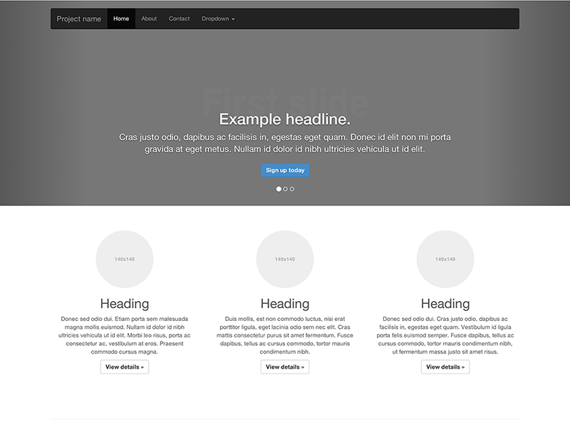
Customize the navbar and carousel, then add some new components.
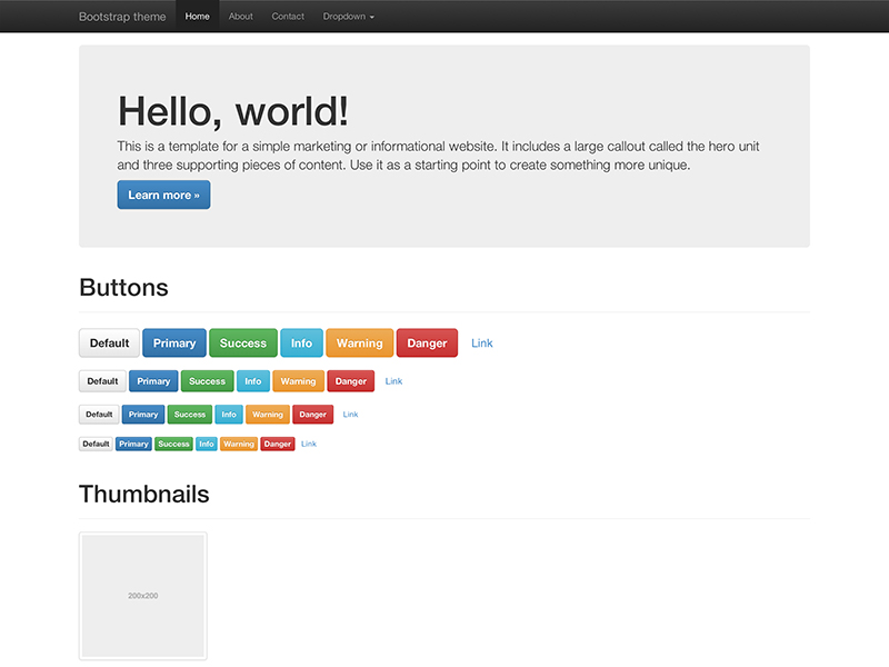
Load the optional Bootstrap theme for a visually enhanced experience.
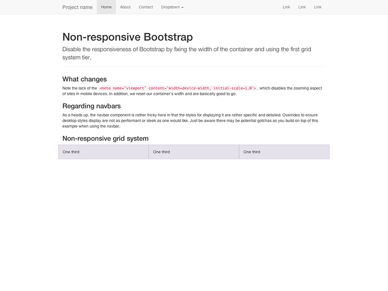
Don't want your site or application to be scaled on different devices? With a little bit of work, you can disable the responsive features of Bootstrap so that mobile users see your full desktop-version site. Read below or check out the non-responsive example.
To disable responsive features, follow these steps. See it in action in the modified template below.
<meta> mentioned in the CSS docsmax-width on the .container for all grid tiers with max-width: none !important; and set a regular width like width: 970px;. Be sure that this comes after the default Bootstrap CSS. You can optionally avoid the !important with media queries or some selector-fu..col-xs-* classes in addition to or in place of the medium/large ones. Don't worry, the extra-small device grid scales up to all resolutions, so you're set there.You'll still need Respond.js for IE8 (since our media queries are still there and need to be picked up). This just disables the "mobile site" of Bootstrap.
We've taken the above steps and applied them to an example. Read it's source code to see the specific changes called out.
Folks looking to upgrade to v3 should use this section as a general upgrade guide. We've outlined some of the major changes and provided tables that highlight key changes. For an overview, read the announcement blog post.
Reference table for classes that have changed between v2.x and v3.0.
| Bootstrap 2.x | Bootstrap 3.0 |
|---|---|
.container-fluid |
.container |
.row-fluid |
.row |
.span* |
.col-md-* |
.offset* |
.col-md-offset-* |
.brand |
.navbar-brand |
.nav-collapse |
.navbar-collapse |
.nav-toggle |
.navbar-toggle |
.btn-navbar |
.navbar-btn |
.hero-unit |
.jumbotron |
.icon-* |
.glyphicon .glyphicon-* |
.btn |
.btn .btn-default |
.btn-mini |
.btn-xs |
.btn-small |
.btn-sm |
.btn-large |
.btn-lg |
.visible-phone |
.visible-sm |
.visible-tablet |
.visible-md |
.visible-desktop |
.visible-lg |
.hidden-phone |
.hidden-sm |
.hidden-tablet |
.hidden-md |
.hidden-desktop |
.hidden-lg |
.input-small |
.input-sm |
.input-large |
.input-lg |
.checkbox.inline .radio.inline |
.checkbox-inline .radio-inline |
.input-prepend .input-append |
.input-group |
.add-on |
.input-group-addon |
.thumbnail |
.img-thumbnail |
ul.unstyled |
.list-unstyled |
ul.inline |
.list-inline |
We've added a few new elements and changed some existing ones. Here's their new or updated classes.
| Element | Description |
|---|---|
| Panels | .panel .panel-default .panel-body .panel-title .panel-heading .panel-footer .panel-collapse |
| List groups | .list-group .list-group-item .list-group-item-text .list-group-item-heading |
| Glyphicons | .glyphicon |
| Jumbotron | .jumbotron |
| Tiny grid (<768 px) | .col-xs-* |
| Small grid (>768 px) | .col-sm-* |
| Medium grid (>992 px) | .col-md-* |
| Large grid (>1200 px) | .col-lg-* |
| Offsets | .col-sm-offset-* .col-md-offset-* .col-lg-offset-* |
| Push | .col-sm-push-* .col-md-push-* .col-lg-push-* |
| Pull | .col-sm-pull-* .col-md-pull-* .col-lg-pull-* |
| Input groups | .input-group .input-group-addon .input-group-btn |
| Form controls | .form-control .form-group |
| Button group sizes | .btn-group-xs .btn-group-sm .btn-group-lg |
| Navbar text | .navbar-text |
| Navbar header | .navbar-header |
| Justified tabs / pills | .nav-justified |
| Responsive images | .img-responsive |
| Contextual table rows | .success .danger .warning .active |
| Contextual panels | .panel-success .panel-danger .panel-warning .panel-info |
| Modal | .modal-dialog .modal-content |
| Thumbnail image | .img-thumbnail |
| Well sizes | .well-sm .well-lg |
| Alert links | .alert-link |
The following elements have been dropped or changed in v3.
| Element | Removed from 2.x | 3.0 Equivalent |
|---|---|---|
| Form actions | .form-actions |
N/A |
| Search form | .form-search |
N/A |
| Fluid container | .container-fluid |
.container (no more fixed grid) |
| Fluid row | .row-fluid |
.row (no more fixed grid) |
| Navbar inner | .navbar-inner |
N/A |
| Dropdown submenu | .dropdown-submenu |
N/A |
| Tab alignments | .tabs-left .tabs-right .tabs-below |
N/A |
We've made many underlying changes in v3 that are not immediately apparent. Base classes, key styles, and behaviors have been adjusted for flexibility and our mobile first approach.
<div class="col-*"></div> to control input widths..badge no longer has contextual (-success,-primary,etc..) classes..btn must also use .btn-default to get the "default" button..container and .row are now fluid (percentage-based)..img-responsive for fluid <img> size..glyphicon, are now font based. They also require a base and icon class (e.g. .glyphicon .glyphicon-asterisk)..modal-header, .modal-body, and .modal-footer sections now get wrapped in .modal-content and .modal-dialog for improved mobile styling and behavior.'show.bs.modal'. For tabs "shown" use 'shown.bs.tab', etc..For more information on upgrades and code snippets from the community check out Bootply.
Bootstrap is built to work best in the latest desktop and mobile browsers, meaning older and less advanced browsers might receive a less stylized, though fully functional, version of certain components.
Specifically, we support the latest versions of the following:
Unofficially, Bootstrap should look and behave well enough in Chromium for Linux and Internet Explorer 7, though they are not officially supported.
Internet Explorer 8 and 9 are also supported, however, please be aware that many CSS3 properties—e.g., rounded corners and shadows—are not supported by IE8. The placeholder attribute is also not supported in either of these versions.
In addition, Internet Explorer 8 requires the use of respond.js to enable media query support.
Bootstrap is not supported in the old Internet Explorer compatibility modes. To be sure you're using the latest rendering mode for IE, consider including the appropriate <meta> tag in your pages:
<meta http-equiv="X-UA-Compatible" content="IE=edge">
See this StackOverflow question for more information.
Internet Explorer 10 doesn't differentiate device width from viewport width, and thus doesn't properly apply the media queries in Bootstrap's CSS. To address this, you can optionally include the following CSS and JavaScript to work around this problem until Microsoft issues a fix.
@-webkit-viewport   { width: device-width; }
@-moz-viewport      { width: device-width; }
@-ms-viewport       { width: device-width; }
@-o-viewport        { width: device-width; }
@viewport           { width: device-width; }
if (navigator.userAgent.match(/IEMobile\/10\.0/)) {
  var msViewportStyle = document.createElement("style")
  msViewportStyle.appendChild(
    document.createTextNode(
      "@-ms-viewport{width:auto!important}"
    )
  )
  document.getElementsByTagName("head")[0].appendChild(msViewportStyle)
}
For more information and usage guidelines, read Windows Phone 8 and Device-Width.
In the latest Safari for Mac, its rendering engine has a little trouble with the long decimal places of our .col-*-1 grid classes, meaning if you have 12 individual columns you'll notice they come up short compared to other rows of columns. There's not much we can do here (see #9282) but you do have some options:
.pull-right to your last grid column to get the hard-right alignmentWe'll keep an eye on this though and update our code if we have an easy solution.
Support for overflow: hidden on the <body> element is quite limited in iOS and Android. To that end, when you scroll past the top or bottom of a modal in either of those devices' browsers, the <body> content will begin to scroll.
Also, note that if you're using inputs in your modal – iOS has a rendering bug which doesn't update the position of fixed elements when the virtual keyboard is triggered. There are a few work arounds for this, including transforming your elements to position: absolute or invoking a timer on focus to try to correct the positioning manually. This is not handled by Bootstrap, so it is up to you to decide which solution is best for your application.
Page zooming inevitably presents rendering artifacts in some components, both in Bootstrap and the rest of the web. Depending on the issue, we may be able to fix it (search first and then open an issue if need be). However, we tend to ignore these as they often have no direct solution other than hacky workarounds.
While we don't officially support any third party plugins or add-ons, we do offer some useful advice to help avoid potential issues in your projects.
If you're using Google Maps on a Bootstrapped project, you might run into some display problems due to our use of * { box-sizing: border-box; }. Previously, you may have also ran into issues with the use of max-width on images. The following snippet should avoid all those problems.
/* Fix Google Maps canvas
 *
 * Wrap your Google Maps embed in a `.google-map-canvas` to reset Bootstrap's
 * global `box-sizing` changes. You may optionally need to reset the `max-width`
 * on images in case you've applied that anywhere else. (That shouldn't be as
 * necessary with Bootstrap 3 though as that behavior is relegated to the
 * `.img-responsive` class.)
 */

.google-map-canvas,
.google-map-canvas * { .box-sizing(content-box); }

/* Optional responsive image override */
img { max-width: none; }
Bootstrap follows common web standards, and with minimal extra effort, can be used to create sites that are accessibile to those using AT.
If your navigation contains many links and comes before the main content in the DOM, add a Skip to content link immediately after your opening <body> tag. (read why)
<body>
  <a href="#content" class="sr-only">Skip to content</a>
  <div class="container" id="content">
    The main page content.
  </div>
</body>
Another "gotcha" has to do with how you nest your <header> elements. Section 508 states that your largest header must be an h1, and the next header must be an <h2>, etc. This is hard to achieve in practice, but if the largest header on your site is smaller than Bootstrap's default 38px, you should consider modifying your stylesheets before using a smaller header element.
Bootstrap is released under the Apache 2 license and is copyright 2013 Twitter. Boiled down to smaller chunks, it can be described with the following conditions.
The full Bootstrap license is located in the project repository for more information.
Customizing Bootstrap is best accomplished when you treat it as another dependency in your development stack. Doing so ensures future upgrades are as easy as possible while also familiarizing yourself to the intricacies of the framework.
Once you've downloaded and included Bootstrap's CSS into your templates, you can move on to customizing the included components. To do so, create a new stylesheet (LESS, if you like, or just plain CSS) to house your customizations.
Unless you plan on reading a good chunk of the compiled CSS, go with the minified. It's the same code, just compacted. Less bandwidth is good, especially in production environments.
From there, include whatever Bootstrap components and HTML content you need to get your template setup. It's best to have a rough idea in mind of modifications to make and content to include, so be sure to spend a brief amount of time on that before moving on.
There are varying degrees to customizing components, but most fall into two camps: light customizations and complete visual overhauls. Luckily, there are plenty of examples of both.
We define light customizations as mostly surface layer changes, things like a color and font changes to existing Bootstrap components. A great example of this is the the Twitter Translation Center (coded by @mdo). Let's look at how to implement the custom button we wrote for this site, .btn-ttc.
Instead of using the provided Bootstrap buttons, which only require just one class to start, .btn, we'll add our own modifier class, .btn-ttc. This will give us a slightly custom look with minimal effort.
<button type="button" class="btn btn-ttc">Save changes</button>
In the custom stylesheet, add the following CSS:
/* Custom button
-------------------------------------------------- */

/* Override base .btn styles */
/* Apply text and background changes to three key states: default, hover, and active (click). */
.btn-ttc,
.btn-ttc:hover,
.btn-ttc:active {
  color: white;
  text-shadow: 0 -1px 0 rgba(0, 0, 0, 0.25);
  background-color: #007da7;
}

/* Apply the custom-colored gradients */
/* Note: you'll need to include all the appropriate gradients for various browsers and standards. */
.btn-ttc {
  background-repeat: repeat-x;
  background-image: linear-gradient(top, #009ED2 0%, #007DA7 100%);
  ...
}

/* Set the hover state */
/* An easy hover state is just to move the gradient up a small amount. Add other embellishments as you see fit. */
.btn-ttc:hover {
  background-position: 0 -15px;
}
Customizing Bootstrap components takes time, but should be straightforward. Look to the source code often and duplicate the selectors you need for your modifications. Placing them after the Bootstrap source makes for easy overriding without complication. To recap, here's the basic workflow:
.navbar.!important here.Going beyond light customizations and into visual overhauls is just as straightforward as the above custom button. For a site like Karma, which uses Bootstrap as a CSS reset with heavy modifications, more extensive work is involved, but well worth it in the end.
While not recommended for folks new to Bootstrap, you may use one of two alternate methods for customization. The first is modifying the source .less files (making upgrades super difficult), and the second is mapping source LESS code to your own classes via mixins. For the time being, neither of those options are documented here.
Not all sites and applications need to make use of everything Bootstrap has to offer, especially in production environments where bandwidth literally becomes a financial issue. We encourage folks to remove whatever is unused with our Customizer.
Using the Customizer, simply uncheck any component, feature, or asset you don't need. Hit download and swap out the default Bootstrap files with these newly customized ones. You'll get vanilla Bootstrap, but without the features *you* deem unnecessary. All custom builds include compiled and minified versions, so use whichever works for you.